User Tools
Sidebar
report_heatmap
Book Creator
Add this page to your book
Add this page to your book
Book Creator
Remove this page from your book
Remove this page from your book
This is an old revision of the document!
Heatmap statistics
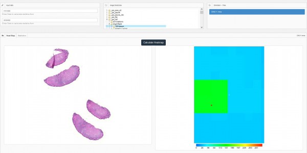
Heatmap of a slide is a calculated statistic by PMA.core that shows the regions that users request more often in a slide and thus be of more importance. This is displayed in a colorful image with more reddish colors indicating regions of the image requested more times by users, as is the case with typical heatmaps in other fields. At the bottom of the heatmap you can see the color legend describing what each color indicates the number of times a region was requested by users
To generate a Heatmap for a specific slide you need to:
- Select a date range to request usage data. You can narrow this range to your needs
- Select the folder that contains the slide you want in the middle column
- Select the slide you want in the last column
- After the thumbnail of the slide is shown click on “Calculate Heatmap”
report_heatmap.1648648127.txt.gz · Last modified: 2022/03/30 16:48 by antreas

